
When first getting started in accessibility, the WCAG and PDF/UA standards can feel overwhelming. Don’t get bogged down by the technical standards. Instead, keep their purpose in mind: To make content available to as many people as possible. We believe in progress over perfection. Any changes you make will help your content be accessible to many more people, and that is worth celebrating.
Here are three accessibility steps anyone can take, even without technical IT expertise or an accessibility credential.
Accessibility Keywords
You may come across some new words and phrases when you’re just getting started in accessibility. Check out our Accessibility Keywords resource for definitions of the terms — and then bookmark it for easy reference as you get rolling on your accessibility journey.
Three Accessibility Steps
1. Keep an eye out for color issues
Color is a big deal in accessibility. Multiple WCAG guidelines address it. Meaningful information needs to have a strong color contrast between the information and its background. Think of the P in POUR, which stands for “perceivable.” Without a strong color contrast, readers won’t be able to see, or perceive, the content.
Additionally, ensure that color is not the only way you convey information. For example, when developing a flyer, you would not want to refer to “the blue text below.” What if someone printed out the flyer in black and white? They would no longer be able to perceive the color. Instead, you could bold the text for emphasis and refer to “the bold text below.”

2. Provide text alternatives
This is an easy step to take. If you include images that convey information, add alternate text, or “alt text” to them. Don’t overthink it. Simply provide a brief description of the image within the context it is being used. Alt text is needed for images within PDFs, websites, and apps.
The text alternative for video and motion graphics are closed captions and transcripts. Check that the closed captions and transcripts accurately convey what was said or is being said in your live or recorded video. Artificial intelligence can help you get an initial draft of the closed captions and transcripts, but a human needs to review them for accuracy.

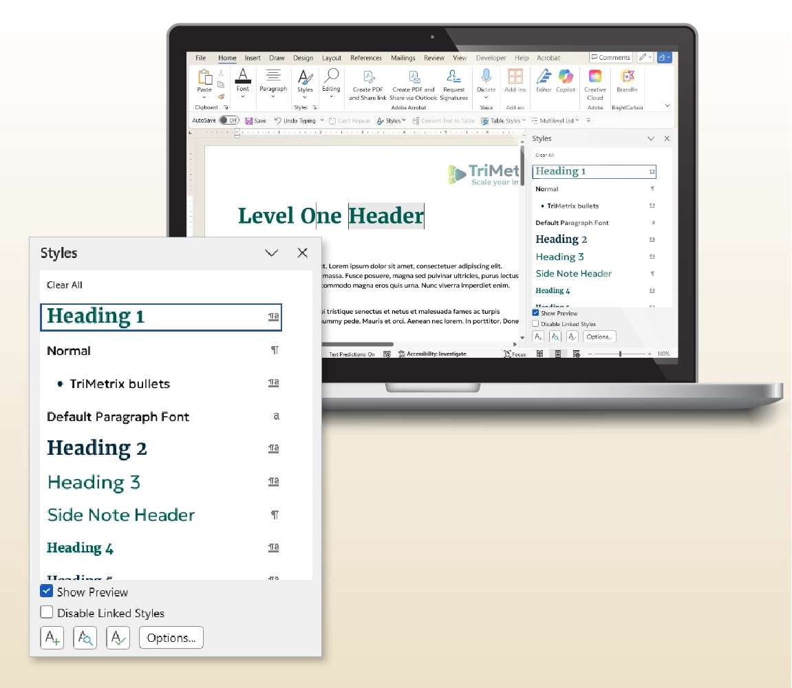
3. Check your information hierarchy
When you write or design content, keep its outline in mind. How you structure the content matters. Each document or webpage should only have one Heading Level 1. After that, any heading levels should be assigned Heading Level 2, followed by Heading Level 3, and so on. Do not jump from Heading Level 2 to Heading Level 4. You’ll leave your readers, sighted or not, confused about what happened to Heading Level 3.
Do not use heading levels as a form of creativity. The heading levels should go in order, like the outline of a paper. If you want the visuals of the heading levels to be more creative, talk to your designer or developer about adjusting the typography styles in your document or website. “Styles,” or a set of predesigned text formatting, are an imperative component of creating accessible content in PDFs or on webpages.
Next Steps
Taking these first steps will make your content more accessible to all users. Continue learning more about accessibility by exploring more of our resources. Good luck on your accessibility journey!
Written by Lindsey Engelhardt, MBA, Content and Design Manager

Accessibility
Ensure your materials are accessible to as many people as possible.
Need a partner with expertise in accessibility?

Services
Head to our home page to see how our services can support your organization.

Client Stories
See what’s possible when we work together to drive change.