
We start every new branding or rebranding project with some short questions:
Who are you? What do you do?
These questions are often met with long pauses. They can be hard for teams to answer.
In 2025, our team at TriMetrix needed to answer these questions ourselves. We had grown to include three brands: TriMetrix, our WRMA subsidiary, and our TTG division. Each had a distinct color scheme, logo, and messaging—along with distinct outreach channels via websites, email, and social media platforms. Our team needed more than just polishing. We needed clarity. That required looking in and out and in again to create a new brand and website.
Fortunately, we had a team of designers on staff through our Center of Excellence for Learning Resources and Communication to lead the TriMetrix rebrand. Below, Content and Design Manager Lindsey Engelhardt shares how this project came together.
Research and Strategy
Looking In
Often clients want to jump right into logo design, but that approach misses the bigger picture. Just like there’s intentionality with business decisions, design decisions should be intentional too. Branding is about more than a logo. It’s about discovery—discovering the layers that make your team unique.
We start all branding projects, including ours, with messaging development and research. Answering the questions “Who are you? What do you do?” requires executive-level discussions and strategic alignment. We collaborated with our executive team to tease out company-wide core values, clarify goals, and identify a unifying mission.
Looking Out
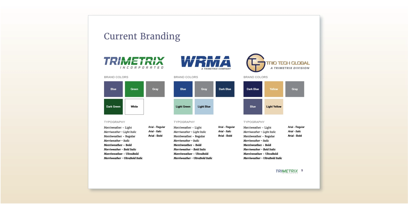
With the vision defined, we documented our current branding to see it in one spot. We then expanded research beyond our company to analyze other brands in the health and human services consulting space. That included documenting fonts, colors, logos, and messaging. By seeing these elements broken down, we were able to begin to discover what makes TriMetrix, TriMetrix.
Looking in Again
This research helped our new brand differentiators come into focus. We connected the dots to our target audiences, including their goals and needs. Taken alongside our core values, a path toward brand positioning and objectives began to emerge.
Logo Development
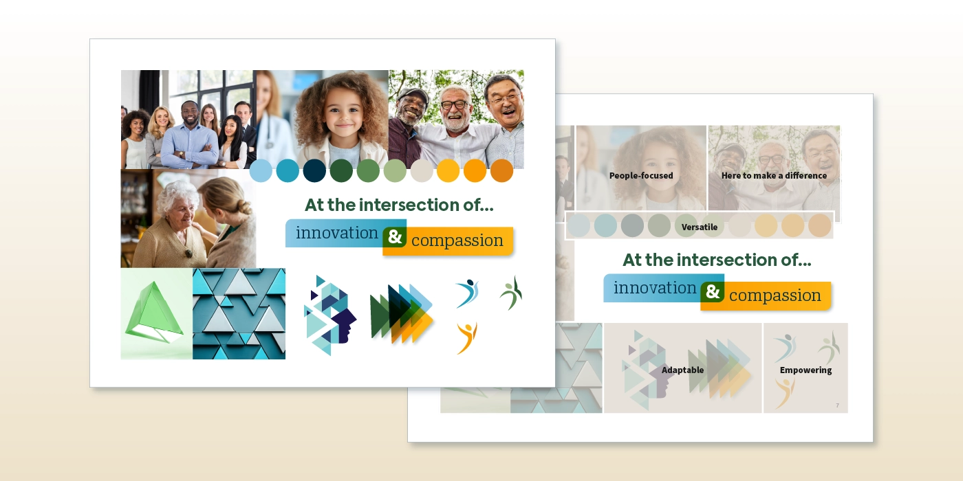
The foundational research led us to mood boards, where we explored approaches for a new color scheme, graphical mark, and typography set. Each approach aligned with our values, mission, and brand positioning. We designed and iterated alongside our executive team to explore visual meaning and color theory.
Triangles became the focus of our visual exploration, inspired by our company name and the shape’s versatility. It provides endless possibilities. To bring in our company value of being people-focused, we also identified the need for organic, hand-drawn components. With mood boards designed, we were ready to move into logo development.
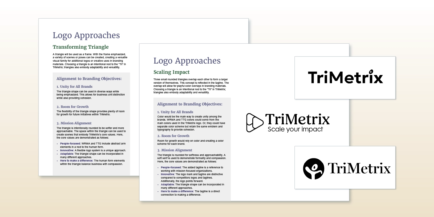
Color is exciting! It brings energy and possibility. It can also be distracting at the early stages of a logo project and lead to muddy decisions. To keep things in focus, our initial logo drafts were developed in black and white. We created four distinct logo approaches, all of which aligned to our branding objectives and mood boards. Starting with black and white logos allows the focus to be on form and function, ensuring the resulting logo will work at all sizes and in all production scenarios.
Color came back into the picture once we solidified the black and white logo. We explored color palettes that aligned with our mood boards and reflected the previous colors found in our company brands. We highly value accessibility and inclusivity, so we also ensured the new color palette would easily support high color contrast ratios. We presented a variety of ways to incorporate color into the logo, with our executive team selecting the final direction.
New Brand Expansion
Many decisions had been made at this point. We documented our messaging, audiences, company structure, brand positioning, and logo in our new brand guidelines. We also developed cohesive logos for WRMA and TTG to visually bring them into the TriMetrix family.
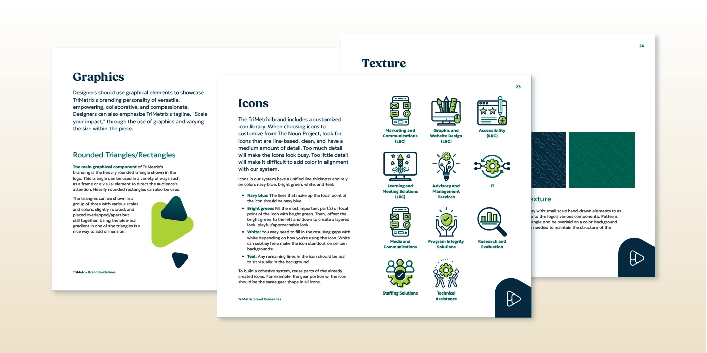
Then, we were ready for the fun part that often gets overlooked in logo projects: supportive visuals. Our design team played and experimented with new styles for graphical elements including patterns, textures, icon sets, graphic approaches, and imagery guidelines to build a full design system.
Each piece of the system ensures brand consistency across design mediums. It also allowed us to efficiently build a variety of templates for documents, presentations, social media, and e-newsletters.
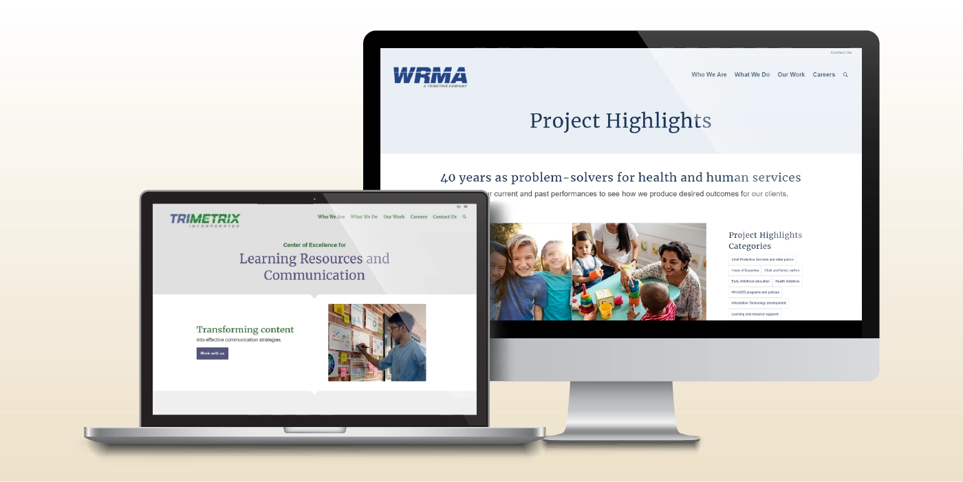
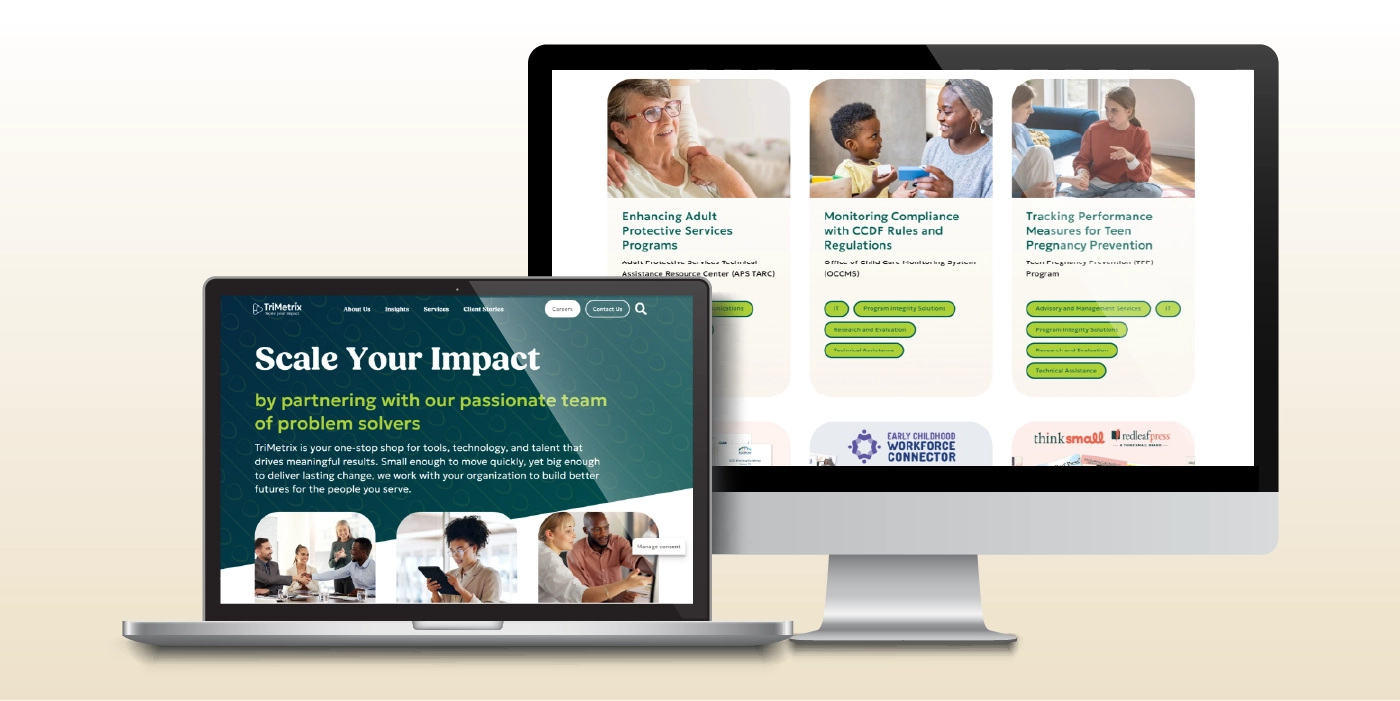
Meanwhile, we also began designing and developing the new website you’re visiting right now. With the brand guidelines and design system established, we were able to efficiently design a new website that reflected and expanded on our new brand.
If you like the new TriMetrix brand, we invite you to explore our other rebranding projects and design services led by our Center of Excellence for Learning Resources and Communication.

Are you considering a branding project? Let’s discover what your team’s brand identity could be.

Services
Head to our home page to see how our services can support your organization.

Client Stories
See what’s possible when we work together to drive change.