
Designing with accessibility in mind starts with understanding the language behind it. Accessibility has its own set of terms, and learning them is one of the best ways to start incorporating accessibility into your work. Whether you’re creating a document, updating a website, or developing a report with tables and graphics, knowing key terms and standards helps you make choices that support every user.
Ready to design with accessibility in mind? Use these keywords to get started in digital accessibility.
Color Contrast
Alternative Text (alt text)
Reading Order
Accessibility Key Terms
Below are brief descriptions of key terms or components for designing with accessibility in mind. Learning these terms will help people better understand accessibility and learn to fix, or “remediate,” accessibility errors they come across.
1. Accessibility Standards (WCAG and PDF/UA)
In the U.S., the federal agency that develops accessibility standards is the U.S. Access Board. The board aligns with the internationally recognized standards PDF/UA for its PDF-based standards and WCAG for its web-based standards. Additionally, the U.S. Department of Health and Human Services has its own set of standards.
- WCAG standards: The Web Content Accessibility Guidelines were developed by the World Wide Web Consortium (W3C). They keep up-to-date guidelines to ensure web content is accessible for those with visual, motor, and/or hearing impairments.
- PDF/UA standards: PDF/UA is the ISO standard (ISO 14289) for accessible PDF documentation. The goal for digital document accessibility is to have an accessible PDF. Following these standards on a PDF will allow seamless access for screen readers and other assistive technology to navigate a document.
- Section 508: Section 508 is part of the Rehabilitation Act of 1973. It requires federal agencies to make their digital communications materials accessible. This law is specific to federal agencies.
- ADA: The Americans with Disabilities Act (ADA) requires equal access to public services, programs, and activities. The ADA includes a Title II provision that is specific to state and local governments, while Title III applies to businesses that serve the public. Numerous court rulings have established that websites are places of public accommodation.
2. POUR
Short for perceivable, operable, understandable, and robust. WCAG is based on these four principles of accessibility. When a digital product adheres to all of these principles it is considered accessible.
3. Accessibility Specialist
A person trained in identifying and remediating barriers that prevent users from having equal access to content. These people often have expertise and familiarity with accessibility standards, tools, and testing processes, all of which aids clients in achieving inclusive design and development goals.
4. Accessibility Tests
- Automated checks: There are various levels of automated checks that can be run on digital communications tools. The basic checks, which can be performed in source-level software such as Microsoft Word or PowerPoint, are not enough to pass the comprehensive standards for WCAG or PDF/UA. For PDFs, a check in Adobe Acrobat is a better output than the Word or PowerPoint, but still not to the level required for PDF/UA. More robust automated checks, such as Axe DevTools for web or PAC2024 for PDF, provide the most comprehensive automated checks. Even after passing these checks, the material still needs to be checked manually by a human and a screen reader.
- Manual checks: This is the human evaluation process where in the specialist uses various screen readers on multiple platforms to identify what the automated software tools may have missed. These could include unwanted focus on content, illogical tab order, and meaningful uses of sematic HTML landmarks.
5. Remediation
Remediation is the process of correcting accessibility issues in a completed document or website. Common remediation tasks include tagging elements, correcting reading order, adding alt text, fixing contrast issues, and structuring tables. However, these tasks take time and resources. By incorporating accessibility into your design and authoring workflow early, you reduce the need for extensive remediation later.
6. Tags and Tag Tree
One key feature of a PDF is its use of tags. When correctly set up and exported, a PDF will provide a list of tags and their classifications. This list of tags is referred to as a tag tree. Classifications such as < p > (meaning a paragraph tag), < TOC > (meaning a Table of Contents tag), or < H1 > (meaning a Headline 1 tag) help users navigate the document and understand the hierarchy of the content.
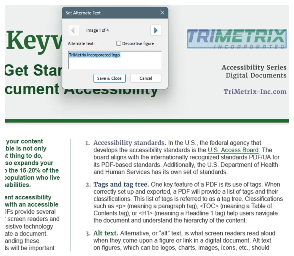
7. Alternative Text (Alt Text)
Alternative, or “alt” text, is what screen readers read aloud when they come upon a figure or link in a digital document. Alt text on figures, which can be logos, charts, images, icons, etc., should succinctly describe what sighted people see when they look at the figure. Alt text for links should describe where the link leads so users have a sense of where they will be taken if they select the link.
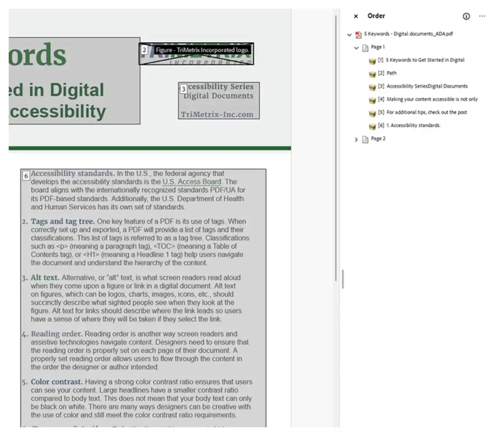
8. Reading Order
Reading order is another way screen readers navigate content. Designers need to ensure that the reading order is properly set on each page of their document. A properly set reading order allows users to flow through the content in the order the designer or author intended.
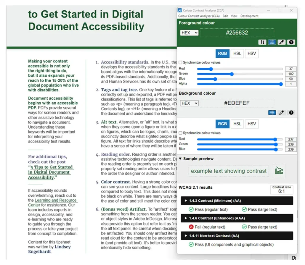
9. Color Contrast
Having a strong color contrast ratio ensures that users can see your content. Large headlines have a smaller contrast ratio compared to body text. This does not mean that your body text can only be black on white. There are many ways designers can be creative with the use of color and still meet the color contrast ratio requirements.
10. Artifacts
To “artifact” something means to hide something from the screen reader. You can do this using paragraph or object styles in Adobe InDesign. Microsoft Word and PowerPoint also provide this option but refer to it as “mark as decorative” within the alt text panel. Be careful when deciding whether something should be artifacted. You should only artifact items that do not need to be read aloud for the content to be understood. When in doubt, leave it in (and provide alt text). It’s better to provide more information than to intentionally hide something.
11. Functional Table of Contents (TOC)
A functional TOC makes it easier for users to jump to the content they need. It should be created using the built-in features of your document software, like Word’s navigation panel or InDesign’s TOC tools. This approach allows the TOC to generate clickable links and a logical structure that works well with assistive technologies. It also ensures screen reader users can navigate the document effectively. As a bonus, any edits to your heading structure will automatically update in the TOC, saving time and effort.
12. Styles
Styles refer to the pre-set formatting tools in programs like Microsoft Word or Adobe InDesign. When you apply styles to elements like headings, lists, or body text, you create a consistent structure that is critical for accessibility. Styles also directly influence how your document will be tagged when exported to PDF. Manually changing font sizes or bolding text without applying a style may look correct visually but leaves assistive technology with no guidance about the content’s structure. Styles provide that clarity.
13. Metadata
Metadata includes background information about your document such as the title, author, subject, and keywords. This information is important for both searchability and accessibility. Assistive technologies use metadata to help users understand the purpose and origin of a document. Metadata should be added at the source level, not just in the final PDF. This ensures that updates to the content don’t result in outdated or missing metadata. Most software allows you to input metadata during export or within the document properties panel.
14. Screen Reader
A screen reader is a type of assistive technology that reads digital content aloud. For a screen reader to function properly, the document must be structured with accessibility in mind. This includes elements like heading levels, lists, table structure, and alt text.Screen readers rely on hidden instructions behind the visual layout. If those instructions are missing or incorrect, users may encounter confusing or incomplete information. Properly structured content makes screen readers an effective bridge between your document and users who rely on them.
15. Table Structure
Tables should be simple, clearly labeled, and follow a logical structure. Avoid merged cells and complex layouts, as these can be difficult for screen readers to interpret. A well-structured table uses clear headers and simple rows and columns that allow assistive technologies to convey the relationships between data accurately. If a designer or author finds the table confusing visually, there is a strong chance that assistive technology will too. Always test table structure for clarity and usability.
Next Steps
Understanding and applying these terms is a foundational step toward creating inclusive, accessible designs. By incorporating accessibility into your workflow from the start, you not only reduce remediation time but also ensure that your content can be used and enjoyed by everyone. Keep learning by exploring more of our free accessibility resources.

Accessibility
Ensure your materials are accessible to as many people as possible.
Need a partner with expertise in accessibility?

Services
Head to our home page to see how our services can support your organization.

Client Stories
See what’s possible when we work together to drive change.