ACCESSIBILITY SERIES
Editor’s note: Accessibility is a hot (and broad) topic, especially now as businesses and organizations seek to expand their diversity, equity, inclusion, and accessibility (DEIA) efforts. Not only is making your content accessible the right thing to do, but it also makes good business sense. The World Health Organization estimates that 15% to 20% of the global population experiences disability. That doesn’t consider temporary disabilities (such as a broken arm) or situational disabilities (being in a noisy room and needing captions to watch a video). We all benefit from accessibility.
In the U.S. it’s also the law. Companies have been sued under the Americans with Disabilities Act for not making their content accessible. Additionally, federal agencies (and therefore projects funded by federal agencies) are required by Section 508 of the Rehabilitation Act of 1973 to make their content accessible. The U.S. Department of Health and Human Services takes it a step further and has its own set of standards that go beyond the Section 508 requirements.
But where do you start? With the number of accessibility standards and considerations, it can be easy to feel overwhelmed. The Learning and Resource Center is creating a tip series on accessibility, spanning from digital documents, websites, webinars, e-learning, and more. Different accessibility requirements arise with different situations. For example, take a digital document vs. a webinar. One needs tags, the other needs captions. Our series on accessibility seeks to demystify how designers and e-learning specialists can get started in accessibility.
The goal for digital document accessibility is to have an accessible PDF. PDFs provide several ways for screen readers and other assistive technology to navigate a document. Below are brief descriptions of five key accessibility terms—along with a bonus sixth term. Understanding these terms will be important for interpreting your accessibility test results.
- Accessibility standards (WCAG and PDF/UA): In the U.S., the federal agency that develops the accessibility standards is the U.S. Access Board. The board aligns with the internationally recognized standards PDF/UA for its PDF-based standards. Additionally, the U.S. Department of Health and Human Services has its own set of standards.
- Tags and tag tree. One key feature of a PDF is its use of tags. When correctly set up and exported, a PDF will provide a list of tags and their classifications. This list of tags is referred to as a tag tree. Classifications such as < p > (meaning a paragraph tag), < TOC > (meaning a Table of Contents tag), or < H1 > (meaning a Headline 1 tag) help users navigate the document and understand the hierarchy of the content.
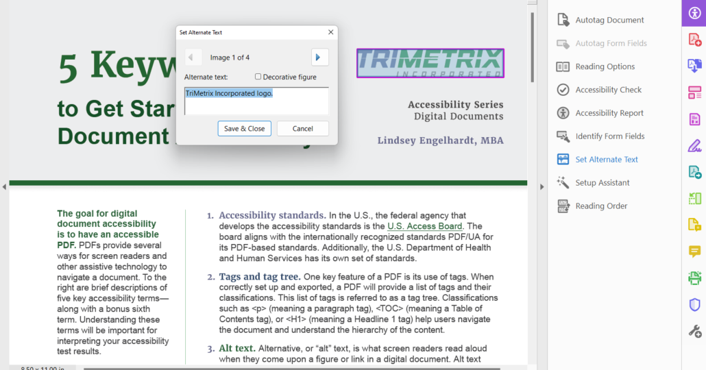
- Alt text. Alternative, or “alt” text, is what screen readers read aloud when they come upon a figure or link in a digital document. Alt text on figures, which can be logos, charts, images, icons, etc., should succinctly describe what sighted people see when they look at the figure. Alt text for links should describe where the link leads so users have a sense of where they will be taken if they select the link.
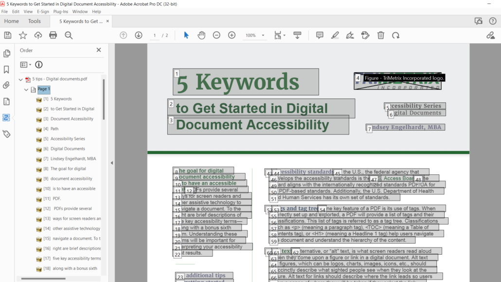
- Reading order. Reading order is another way screen readers navigate content. Designers need to ensure that the reading order is properly set on each page of their document. A properly set reading order allows users to flow through the content in the order the designer or author intended.
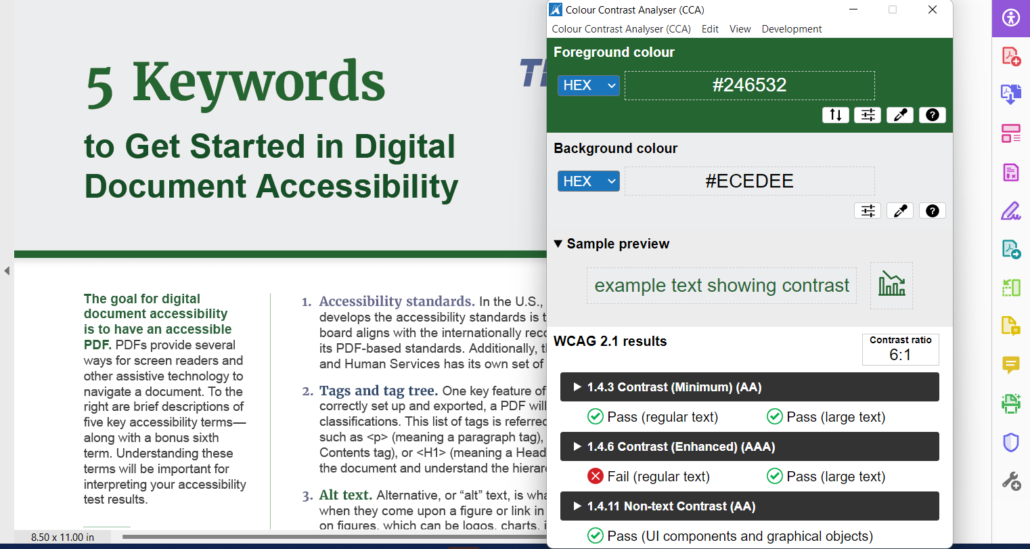
- Color contrast. Having a strong color contrast ratio ensures that users can see your content. Large headlines have a smaller contrast ratio compared to body text. This does not mean that your body text can only be black on white. There are many ways designers can be creative with the use of color and still meet the color contrast ratio requirements.
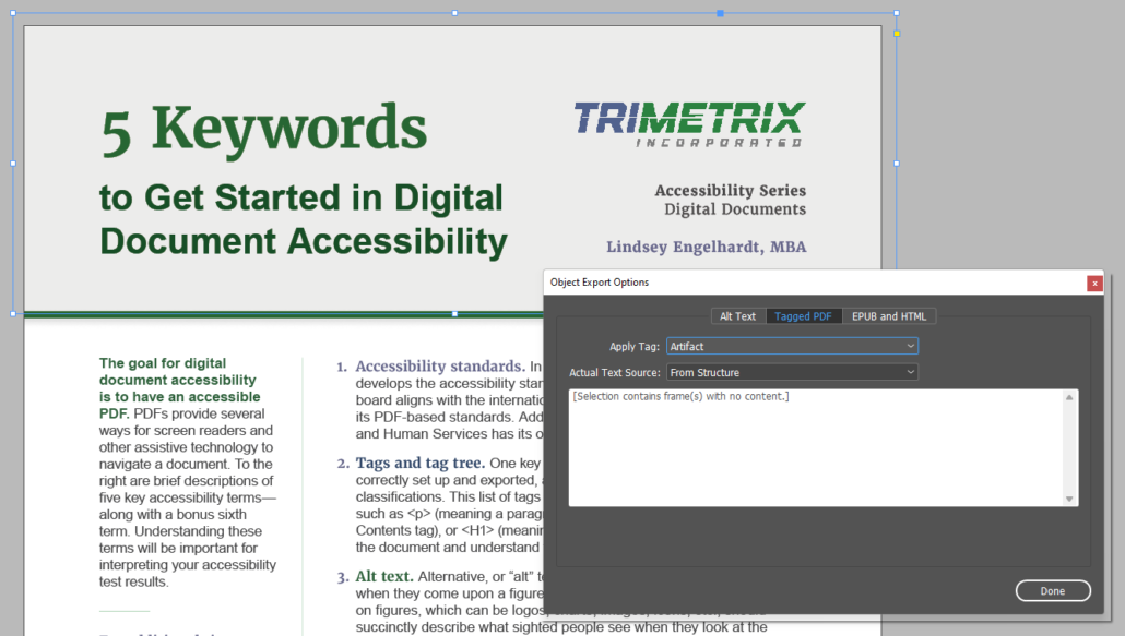
- (Bonus word) Artifacts: To “artifact” something means to hide something from the screen reader. You can do this using paragraph or object styles in Adobe InDesign. Microsoft Word and PowerPoint also provide this option but refer to it as “mark as decorative” within the alt text panel. Be careful when deciding whether something should be artifacted. You should only artifact items that do not need to be read aloud for the content to be understood. When in doubt, leave it in (and provide alt text). It’s better to provide more information than to intentionally hide something.
For additional tips on getting started, check out the post “5 Tips to Get Started in Digital Document Accessibility.”
About the Authoring Team
This resource was written by Learning and Resource Center (LRC) staffer Lindsey Engelhardt based on her presentation at CreativePro’s Design + Accessibility Summit.
TriMetrix’s LRC provided graphic design, copy editing, and 508 remediation for the resource. The LRC works with subject matter experts to make content and messaging come alive for audiences through print and digital content and innovative learning solutions.
Sound overwhelming? Reach out to the Learning and Resource Center for assistance. Our team includes experts in design, accessibility, and e-learning who are ready to guide you through the process or take your project from concept to completion.
